Seven months ago in episode 026, I overhauled this site's color system, migrating from an electric violet palette to emerald teal and introducing scroll-driven timeline animations. That redesign fixed immediate issues like broken keyframes and unstyled utility classes. But as time went on, stepping back to look at the portfolio revealed subtle signs of aging.
The personal website of a senior distributed systems engineer should communicate technical rigor, precision, and architectural discipline. Instead, several design decisions were working against that:
- Playful typography vs. systems engineering: The heading typeface (
Syne) had wide, geometric letterforms that felt more like a boutique creative agency than someone who builds high-throughput Kafka pipelines and debugs WebFlux thread pool exhaustion. - The empty void in Skills: The "Full Toolkit" rendered as a single vertical list on the left side of the screen, leaving more than 50% of the display completely blank on desktop viewports.
- Buried proof metrics: High-impact real-world numbers — handling 50k+ req/sec on WebFlux, scaling batch jobs by 3×, achieving All India Rank 170 (top 0.08% nationwide) in GATE Computer Science among 200,000+ engineers — were buried inside dense paragraphs where recruiters and hiring managers scanning in ten seconds would miss them.
- Header and mobile menu glitches: The navigation was a traditional block header, and the mobile menu had a transparency layering bug where menu items overlapped text directly over the hero.
- Drift between portfolio and blog: While the portfolio evolved, the blog templates remained anchored to the older layout, with disconnected navigation bars and an untextured dark background.
Here is how I audited, redesigned, and unified both halves of the website into a modern developer-themed design system.
1. Typography & Aesthetic Framework: Linear Meets Supabase
Modern developer tools — Linear, Vercel, Supabase, Cloudflare — have defined a recognizable visual standard: high-contrast dark backgrounds, micro-technical grid patterns, razor-sharp sans typography with tight tracking, and monospace accents for data and metrics.
Typography Hierarchy
I replaced Syne as the heading font with Inter and Plus Jakarta Sans, styled with tight negative letter tracking (tracking-tight font-bold). Headings now feel authoritative, structured, and legible at all scale factors.
For technical tags, episode numbers, status indicators, and metric callouts, I introduced JetBrains Mono. Code and metadata now look like they belong in a production IDE:
// tailwind.config.ts fontFamily: { sans: ['Plus Jakarta Sans', 'Inter', '-apple-system', 'BlinkMacSystemFont', 'Segoe UI', 'Roboto', 'sans-serif'], heading: ['Inter', 'Plus Jakarta Sans', 'system-ui', 'sans-serif'], mono: ['JetBrains Mono', 'ui-monospace', 'Menlo', 'Monaco', 'monospace'], }Depth and the Ambient Micro-Grid
A flat black canvas (#09090b) without depth can feel empty or unpolished. To introduce subtle technical texture without clutter, I created a custom CSS background utility combining a 36px micro-grid with an ambient radial teal glow:
/* src/index.css */ .bg-grid-pattern { background-size: 36px 36px; background-image: linear-gradient(to right, rgba(255, 255, 255, 0.035) 1px, transparent 1px), linear-gradient(to bottom, rgba(255, 255, 255, 0.035) 1px, transparent 1px); }Behind the hero and key headers, a radial gradient in emerald teal (rgba(28, 201, 160, 0.08)) provides atmospheric lighting that highlights the primary subject.
2. Floating Island Pill Navigation
The old top bar was a static full-width strip that felt heavy. I redesigned the navigation into a floating frosted-glass pill island:
- Centered Island: Fixed at
top-4, constrained tomax-w-5xl, and floating above the content withbackdrop-blur-mdandbg-background/80. - System Status Indicator: Next to the brand logo (
Jeffrey.Jose), an active monospace status pill with a pulsating green indicator displaysbackend. - Active Navigation Tracking: The navigation tracks the user's scroll position, lighting up the active section (
Home,Writing,Experience,Skills,Projects,Blog,Contact). - One-Click Actions: A high-contrast
Resume.pdfaction button and theme toggle are integrated directly into the bar.
For mobile viewports, I isolated the mobile menu sheet using a dedicated popover surface (bg-popover text-popover-foreground border border-border shadow-2xl) with a fixed inset-0 bg-black/70 backdrop-blur-sm backdrop scrim, eliminating the transparency bleed once and for all.
3. Above-the-Fold Proof Metrics
Recruiters and engineers do not read personal websites sequentially from top to bottom; they scan for verifiable credentials within five seconds.
In the hero section immediately beneath the summary bio, I added a strip of high-density monospace proof chips:
6+ yrs @ Jio Platforms50k+ req/s WebFluxGATE AIR 170 (Top 0.08%)IIT Kharagpur M.Tech
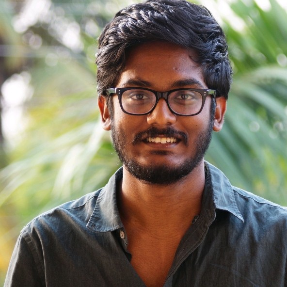
Additionally, the avatar now features a glowing emerald ring with a live pulse dot, signifying availability for high-impact distributed systems engineering opportunities.
4. The Developer Bento Grid for Skills
The most noticeable architectural change on the homepage is the Skills & Architecture section.
Previously, skills were split into a top card and a "Full Toolkit" list that collapsed into a single column on the left, leaving a gaping white (or black) hole across half of wide screens.
I completely rebuilt this into a balanced 6-card Developer Bento Grid:
| Grid Area | Focus | Core Technologies |
|---|---|---|
| 01. Core Architecture (Span 2) | High-concurrency backend & event streaming | Java 21, Spring Boot 3, Apache Kafka, Project Reactor / WebFlux, gRPC, Distributed Locks |
| 02. Data & Storage (Span 1) | Persistence, caching & search | PostgreSQL, Redis, MongoDB, Elasticsearch, Liquibase |
| 03. Cloud & DevOps (Span 1) | Containerization & orchestration | Docker, Kubernetes, AWS, GCP, CI/CD, Prometheus, Grafana |
| 04. Distributed Patterns (Span 2) | Architectural resilience | Microservices, Event-Driven, CQRS, SAGA, Circuit Breakers (Resilience4j) |
| 05. Engineering Leadership (Span 2) | Execution and quality | Architecture Reviews, Mentorship, k6 & JMeter Load Testing, Chaos Testing |
| 06. Verified Credentials (Span 1) | Formal certifications | Spring Professional, Oracle Certified Java SE 11 Developer |
Every card in the grid uses a .dev-card structure with a subtle top-border gradient highlight (.dev-card-highlight) that activates on hover.
5. Experience Timeline & Project Window Chrome
Gradient Timeline Spine
In the Work Experience section (// 02. WORK EXPERIENCE), the timeline was upgraded with an illuminated gradient spine connecting all positions at Jio Platforms. Standout metric callouts (⚡ 3× Batch Speed-up, ⚡ 50k+ Concurrent Reqs, ⚡ 85% Manual Reduction, ⚡ 45% Incident Drop) were pulled out of prose into highlighted badges for instant readability.
macOS Window Chrome on Projects
For featured projects (like the scalable chat platform and TruthMeter AI), each card is framed inside simulated terminal / macOS browser window chrome:
● ● ● domain.dev DEPLOYEDThis frames each project as an active, deployed engineering system rather than a generic card, highlighting architecture features, live demo links, and GitHub repository references.
Academic Distinction Banner
In the Education section, I created a dedicated achievement banner for GATE 2017 Computer Science AIR 170 (Top 0.08% among 200,000+ candidates nationwide), pairing it with my M.Tech research at IIT Kharagpur on distributed computing.
6. Unifying the Blog Architecture
A core principle from CLAUDE.md is: Portfolio and blog share one identity — if you change one, change the other.
Having modernized the portfolio, leaving the blog in its previous state would cause immediate visual drift. I audited the blog generation engine (blog/scripts/build.js) and its templates (blog/templates/):
1. Template Modernization
- Fonts & CSS: Updated
blog/templates/styles.htmlto load Inter, JetBrains Mono, and Plus Jakarta Sans. Integrated the 36px micro-grid and ambient top radial glow so reading an article feels continuous with browsing the portfolio. - Floating Island Header: Replaced the blog's block header in
blog/templates/header.htmlwith the same floating island pill design, complete withJeffrey.Jose · blogbrand status, responsive popover drawer, and⌘Ksearch shortcut. - Author Bio Card: Rebuilt the author bio at the footer of each article with an emerald avatar glow ring and live backend status indicator.
2. Fixing the Hidden { { inlineScripts } } Bug
During visual auditing with browser tooling, I checked the developer console on a generated post page and noticed:
Uncaught ReferenceError: inlineScripts is not definedTracing this down in blog/templates/post.html revealed line 571:
/* Inline scripts injected from frontmatter */ { { inlineScripts } }There was an inadvertent space between the opening curly braces: { { instead of {{. Because build.js uses new RegExp('{{\\s*' + token + '\\s*}}', 'g') for template interpolation, it required two consecutive opening braces. The template variable was never replaced, leaving { { inlineScripts } } as literal JavaScript syntax inside the <script> tag. The browser attempted to evaluate inlineScripts as an identifier and threw an error on every single post page.
Fixing this to resolved the error across all 38 generated post pages.
3. Trailing Slashes for Static Directory Routing
Static sites generated with folder-based permalinks (/blog/post-slug/index.html) require trailing slashes on URLs. When linking to /blog/post-slug without the trailing slash:
- In production, GitHub Pages responds with an HTTP 301 redirect to
/blog/post-slug/. - In local development or SPA preview servers (like Vite preview), requests without trailing slashes trigger history API fallback, landing on the React 404 page.
I updated all post links in blog/scripts/build.js, blog/templates/index.html, blog/templates/header.html, and src/components/RecentWriting.tsx to include trailing slashes (/blog/${slug}/), eliminating the redirect penalty and ensuring seamless navigation everywhere.
The Result
The entire site now presents a unified, cohesive developer aesthetic:
- Clean builds:
npx vite build,npm run lint,npm run build:prerender-harness, andnode blog/scripts/build.jspass with 0 errors. - Hydration safety: All SSR / prerender constraints are strictly maintained.
- Consistency: Navigating between the portfolio, the blog index, and individual technical write-ups now feels like exploring a single, meticulously engineered system.